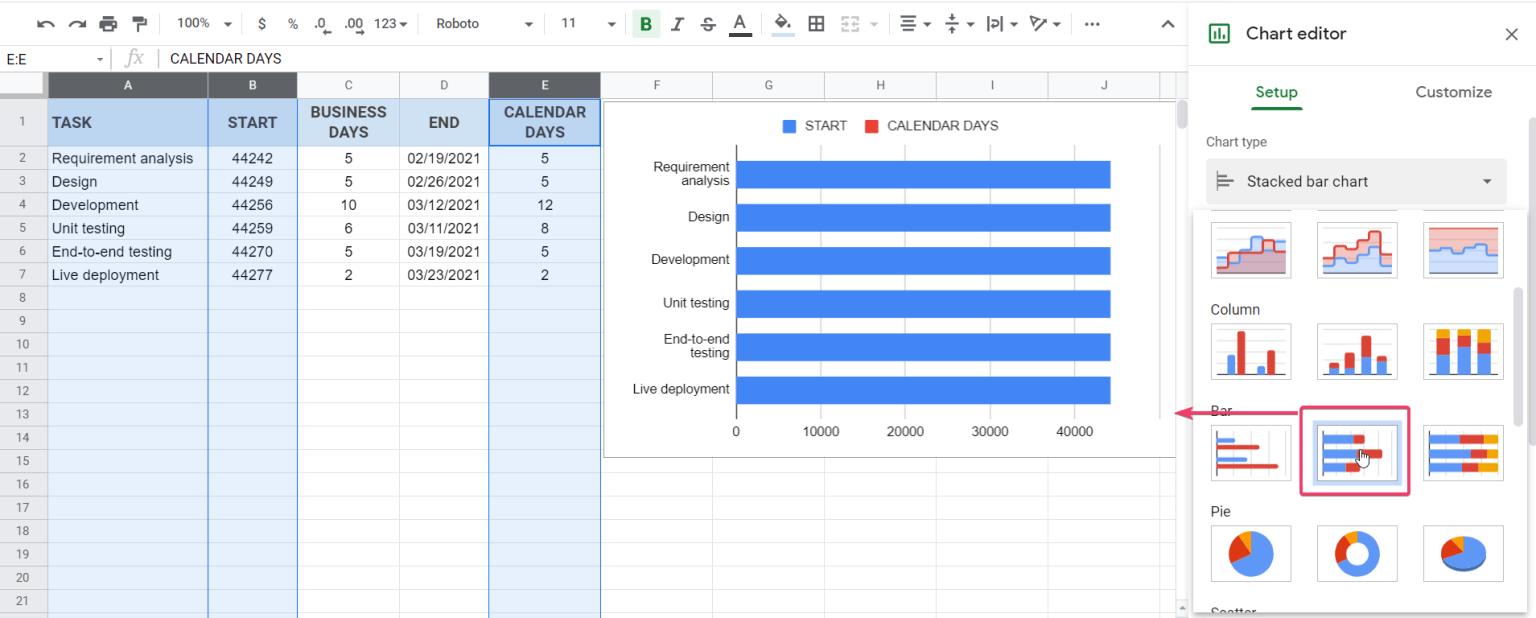
How To Build A Gantt Chart In Google Sheets
Creating a Gantt Chart in Google Sheets: A Step-by-Step Guide
Gantt charts are powerful visual tools for project management. They provide a clear overview of project timelines, task dependencies, and progress. While specialized project management software offers robust Gantt chart functionalities, Google Sheets provides a surprisingly capable and free alternative. This guide will walk you through creating a functional Gantt chart in Google Sheets from scratch.
Step 1: Setting Up Your Data Table
The foundation of any Gantt chart is a well-structured data table. Open a new Google Sheet and prepare the following columns:
- Task Name: (Column A) Enter a descriptive name for each task or project activity. For example, “Requirements Gathering,” “Design Phase,” “Coding,” “Testing,” “Deployment.”
- Start Date: (Column B) Input the exact start date for each task. Ensure the dates are formatted correctly (e.g., MM/DD/YYYY or YYYY-MM-DD). Google Sheets automatically recognizes date formats.
- End Date: (Column C) Enter the end date for each task, also using a consistent date format.
- Duration (Days): (Column D) This column will automatically calculate the duration of each task. We’ll add a formula in the next step.
- Dependencies (Optional): (Column E) If your tasks have dependencies (one task must finish before another begins), list the Task Name of the preceding task here. We won’t cover dependency highlighting in this basic guide but it is useful information for managing your project.
Fill in the “Task Name,” “Start Date,” and “End Date” columns with your project’s information. Leave the “Duration (Days)” column empty for now.
Step 2: Calculating Task Duration
The “Duration (Days)” column will automatically calculate the length of each task in days. In cell D2 (assuming your data starts in row 2), enter the following formula:
=C2-B2
This formula subtracts the start date (B2) from the end date (C2), giving you the number of days the task will take. Drag the fill handle (the small square at the bottom-right corner of cell D2) down to apply this formula to all the other tasks in your list.
Step 3: Creating the Chart Axis (Date Range)
Now we need to create the horizontal axis of our Gantt chart, which represents the overall project timeline. This will involve identifying the project’s start and end dates and then generating a sequence of dates to use as labels.
- Determine Project Start and End Dates: In a separate area of your spreadsheet (e.g., cells G1 and G2), calculate the overall project start and end dates. Use the following formulas:
- Project Start Date (G1):
=MIN(B2:B)(This finds the earliest date in the Start Date column.) - Project End Date (G2):
=MAX(C2:C)(This finds the latest date in the End Date column.)
- Project Start Date (G1):
- Generate Date Range: Starting in cell H1, we’ll create a series of dates spanning the project timeline.
- In cell H1, enter the formula:
=G1(This copies the project start date). - In cell I1, enter the formula:
=H1+1(This adds one day to the previous date). - Drag the fill handle from cell I1 to the right until you have a sufficient number of dates to cover the entire duration of your project (ending on or after the project’s end date in G2). You can always add more columns if needed.
- In cell H1, enter the formula:
Step 4: Adding Conditional Formatting for Task Bars
This is where the magic happens! We’ll use conditional formatting to create the visual bars that represent each task on the Gantt chart. We’ll compare the task’s start and end dates to the date values in row 1 to determine when to apply the formatting.
- Select the Data Range: Select the range of cells where you want the Gantt chart bars to appear. This should start from the cell directly below the first date in your date range (e.g., H2) and extend across all dates and down to encompass all your tasks. Be generous; you can always adjust this later.
- Open Conditional Formatting: Go to Format > Conditional formatting.
- Set Up the Rule:
- Under “Apply to range,” ensure your selected range is correct.
- Under “Format rules,” choose “Custom formula is” from the “Format rules” dropdown.
- Enter the following formula:
=AND(H$1>= $B2, H$1<=$C2)Let's break down this formula:
H$1: Refers to the date in the header row. The$before the1ensures that the row number remains fixed when the formula is applied to other cells in the selected range.$B2: Refers to the start date of the task. The$before theBensures that the column remains fixed.$C2: Refers to the end date of the task. The$before theCensures that the column remains fixed.>=: "Greater than or equal to" - The date in the header row must be greater than or equal to the task's start date.<=: "Less than or equal to" - The date in the header row must be less than or equal to the task's end date.AND(): Ensures that both conditions are true for the cell to be formatted. The cell (representing a day) will be formatted only if it falls within the task's start and end dates.
- Choose a formatting style. Select a fill color (e.g., blue, green, gray) to represent the task bars. You can also change the text color, border, etc.
- Click "Done."
You should now see bars appearing across your spreadsheet, representing the duration of each task based on its start and end dates.
Step 5: Cleaning Up and Customizing the Chart
Your Gantt chart is functional, but some cleanup and customization will improve its readability and presentation.
- Hide Date Values (Optional): If you only want to see the bars and not the underlying date values, select the entire row containing the dates (row 1) and change the text color to white (or the same color as the background).
- Adjust Column Widths: Adjust the width of the date columns to create visually appealing bars. You might want to reduce the width to fit more dates on the screen.
- Freeze Panes: Freeze the Task Name column (Column A) and the row containing the dates (Row 1) to keep them visible when scrolling through large projects. Go to View > Freeze and choose "1 row" and "1 column."
- Add Borders: Add borders to the table to improve readability and visual separation.
- Highlight Weekends: You can add another conditional formatting rule to highlight weekends, making it easier to see workdays. Use the formula
=WEEKDAY(H$1,2)>5(this checks if the date falls on a Saturday or Sunday). - Add Progress Markers: For more advanced charting, consider adding a "Percent Complete" column and incorporating that into your conditional formatting to visually represent task progress.
Congratulations! You have now successfully built a Gantt chart in Google Sheets. Remember to regularly update the start and end dates as your project progresses to keep the chart accurate.
 1536×618 create gantt charts google sheets couplerio blog from blog.coupler.io
  1300×604 gantt chart google sheets smartsheet from www.smartsheet.com
 :max_bytes(150000):strip_icc()/gantt-chart-5c8ac373c9e77c0001e11d0f.png) 1209×806 create gantt chart google sheets from www.lifewire.com
1209×806 create gantt chart google sheets from www.lifewire.com  1387×829 gantt chart google sheets edrawmax from www.edrawmax.com
 Thank you for visiting How To Build A Gantt Chart In Google Sheets. There are a lot of beautiful templates out there, but it can be easy to feel like a lot of the best cost a ridiculous amount of money, require special design. And if at this time you are looking for information and ideas regarding the How To Build A Gantt Chart In Google Sheets then, you are in the perfect place. Get this How To Build A Gantt Chart In Google Sheets for free here. We hope this post How To Build A Gantt Chart In Google Sheets inspired you and help you what you are looking for.
How To Build A Gantt Chart In Google Sheets was posted in August 2, 2025 at 10:42 pm. If you wanna have it as yours, please click the Pictures and you will go to click right mouse then Save Image As and Click Save and download the How To Build A Gantt Chart In Google Sheets Picture.. Don’t forget to share this picture with others via Facebook, Twitter, Pinterest or other social medias! we do hope you'll get inspired by SampleTemplates123... Thanks again! If you have any DMCA issues on this post, please contact us!