Excel-based Gantt Chart With Weekly Timeline
Creating an Effective Excel Gantt Chart with Weekly Timeline
Gantt charts are indispensable tools for project management, offering a visual representation of project schedules, tasks, and dependencies. While dedicated project management software offers advanced features, Microsoft Excel provides a surprisingly versatile platform for creating effective Gantt charts, especially for smaller or less complex projects. Using a weekly timeline in your Excel Gantt chart offers a more granular view, allowing for better tracking of short-term progress and easier identification of potential delays.
Why Use Excel for Gantt Charts?
Excel offers several advantages for Gantt chart creation:
- Accessibility: Most users are already familiar with Excel’s interface and functionalities.
- Cost-Effective: No need to purchase expensive project management software.
- Customization: Excel allows for a high degree of customization to tailor the chart to specific project needs.
- Sharing & Collaboration: Easy to share and collaborate on the spreadsheet with team members.
Building Your Excel Gantt Chart with Weekly Timeline: A Step-by-Step Guide
Here’s a practical guide to building your Gantt chart:
1. Setting up the Data Table
The foundation of your Gantt chart is a well-organized data table. This table will contain the essential information about your project tasks. Columns should include:
- Task Name: A concise description of the task.
- Start Date: The date the task is scheduled to begin.
- Duration (in days): The estimated number of days required to complete the task.
- End Date: Calculated automatically by adding the duration to the start date (Start Date + Duration). This is a formula: `=[@Start Date]+[@Duration]`
- Week Number (Optional but Recommended): Calculate the week number the task starts in. Helpful for visual analysis. The formula is: `=WEEKNUM([@Start Date])`
- Status (Optional): Progress indicators like “Not Started,” “In Progress,” “Completed,” “Delayed.”
- Assigned To (Optional): The person or team responsible for the task.
- Dependencies (Optional): Specify any tasks that need to be completed before this task can start. Useful for more complex charts.
Enter your project’s task information into the data table. Use Excel’s table features (Insert > Table) to make the data dynamic and easier to manage. Name the table something relevant, like “ProjectTasks”.
2. Calculating the Chart Timeline
The next step is to create a timeline that will form the horizontal axis of your Gantt chart. This needs to display weekly date ranges.
- Determine the Project Start and End Dates: Find the earliest start date and the latest end date from your data table. You can use the `MIN` and `MAX` formulas: `=MIN(ProjectTasks[Start Date])` and `=MAX(ProjectTasks[End Date])`.
- Create Weekly Headers: In a row above your data, starting in a new column (e.g., column H), enter the start date of the first week. Then, in the next cell, enter the formula to add 7 days to the previous cell. For instance, if H1 contains the project start date, then in I1 enter `=H1+7`. Drag this formula across the row to create weekly date headers until you reach the project end date.
- Format the Headers: Format the date headers to display only the date, or a shortened date format (e.g., “mmm dd”).
3. Creating the Conditional Formatting Rules
This is where the Gantt chart visualization takes shape. You’ll use conditional formatting to highlight the cells that correspond to the duration of each task.
- Select the Chart Area: Select the range of cells under the weekly date headers, aligned with your task list. Don’t include the date headers themselves.
- Create a New Conditional Formatting Rule: Go to Home > Conditional Formatting > New Rule.
- Use a Formula to Determine Which Cells to Format: Select “Use a formula to determine which cells to format.”
- Enter the Formula: The formula will check if the date in the header row falls within the start and end dates of the corresponding task. Assuming your task list starts in row 2 and your weekly headers start in column H, the formula will be similar to this (adjust cell references as needed): `=AND(H$1>=[@Start Date], H$1<=[@End Date])`. Important: Notice the absolute reference `$1` in `H$1`. This ensures the formula always references the header row.
- Choose a Formatting Style: Click “Format” and choose a background color and, optionally, a border style to represent the task bars.
- Click OK to save the rule.
- Repeat if Needed: You might need to adjust the formula or cell references to match your specific spreadsheet layout.
4. Enhancing the Visuals
Now that you have the basic Gantt chart, you can enhance its visual appeal and readability:
- Color-Coding: Use conditional formatting or manual cell coloring to differentiate tasks based on status (e.g., green for “Completed,” yellow for “In Progress,” red for “Delayed”). You can create multiple conditional formatting rules based on different criteria.
- Gridlines and Borders: Adjust gridlines and borders for clarity. Consider removing gridlines from the chart area for a cleaner look.
- Labels: Add data labels to the chart bars to display task names or other relevant information. You can’t do this directly on the conditional formatting, so consider adding an extra column that shows the “week number” when the cell should be formatted. You can hide that column after.
- Timeline Scaling: Adjust the width of the column headers to display more or fewer weeks at a time. If you have a long project, consider breaking it down into smaller sections or using a smaller time unit (e.g., days instead of weeks, but this can clutter the chart).
- Chart Title and Legend: Add a descriptive chart title and a legend to explain the color-coding scheme.
5. Adding Dependencies (Advanced)
For more complex projects, you can visualize task dependencies. This is more involved but achievable in Excel.
- Dependency Column: Create a column in your data table to specify task dependencies (e.g., list the row number or task name of the preceding task).
- Manual Adjustments: Manually adjust the start dates of dependent tasks based on the completion of their predecessors. Excel doesn’t automatically handle cascading changes due to dependencies. Consider using helper columns to calculate adjusted start dates based on the dependency information.
- Visual Representation: Use arrows or lines to connect dependent tasks visually. You can insert shapes (Insert > Shapes) and manually draw lines to connect the bars. This method requires manual adjustments whenever task dates change.
Limitations of Excel Gantt Charts
While Excel is a useful tool for creating Gantt charts, it has limitations:
- Manual Updates: Updating task durations or dependencies requires manual adjustments, which can be time-consuming for large projects.
- Limited Automation: Excel lacks the advanced automation features of dedicated project management software, such as automatic rescheduling based on dependencies.
- Collaboration Challenges: While sharing is easy, concurrent editing can be problematic, and version control is essential.
- Complexity: Complex projects with numerous dependencies can become unwieldy to manage in Excel.
Conclusion
Creating an Excel Gantt chart with a weekly timeline is a practical solution for visualizing and managing smaller projects. By following these steps, you can create a clear and informative chart to track your project’s progress and ensure timely completion. However, be aware of the limitations of Excel for more complex projects, where dedicated project management software might be a better choice.
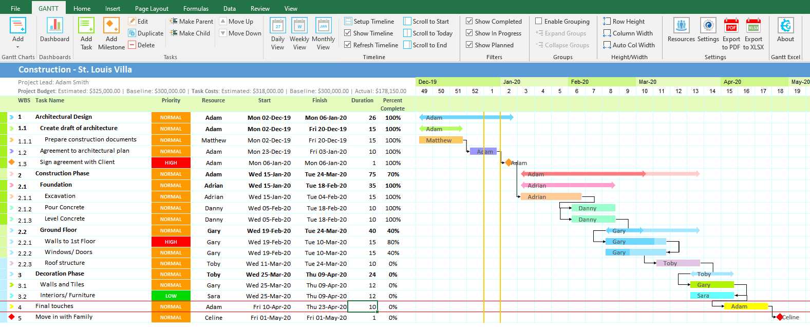 1577×636 weekly gantt chart gantt excel from www.ganttexcel.com
 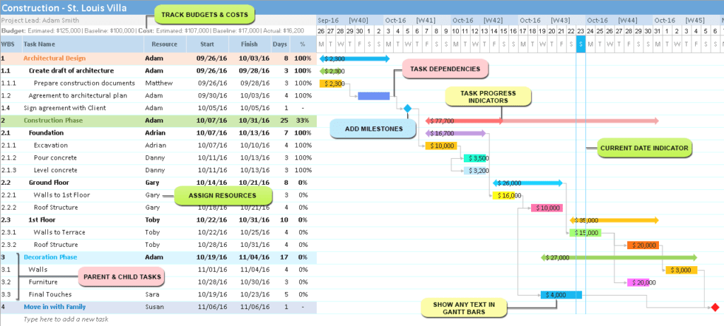 1024×462 gantt excel timeline gantt excel from ganttxl.com
  1024×1024 excel gantt chart flexible project spreadsheet luxtemplates from luxtemplates.com
  1072×804 gantt chart timeline template excel timeline spreadshee gantt chart from db-excel.com
  2455×1736 gantt chart timeline template excel db excelcom from db-excel.com
  1022×556 excel gantt chart prioritization blog from appfluence.com
  0 x 0 gantt chart excel template teamgantt from www.teamgantt.com
 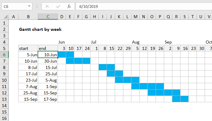 700×400 excel formula gantt chart week exceljet from exceljet.net
 Thank you for visiting Excel-based Gantt Chart With Weekly Timeline. There are a lot of beautiful templates out there, but it can be easy to feel like a lot of the best cost a ridiculous amount of money, require special design. And if at this time you are looking for information and ideas regarding the Excel-based Gantt Chart With Weekly Timeline then, you are in the perfect place. Get this Excel-based Gantt Chart With Weekly Timeline for free here. We hope this post Excel-based Gantt Chart With Weekly Timeline inspired you and help you what you are looking for.
Excel-based Gantt Chart With Weekly Timeline was posted in July 6, 2025 at 8:18 am. If you wanna have it as yours, please click the Pictures and you will go to click right mouse then Save Image As and Click Save and download the Excel-based Gantt Chart With Weekly Timeline Picture.. Don’t forget to share this picture with others via Facebook, Twitter, Pinterest or other social medias! we do hope you'll get inspired by SampleTemplates123... Thanks again! If you have any DMCA issues on this post, please contact us!