How To Create A Gantt Chart Template In Excel
Here’s an HTML structure outlining how to create a Gantt chart template in Excel.
Creating a Gantt Chart Template in Excel
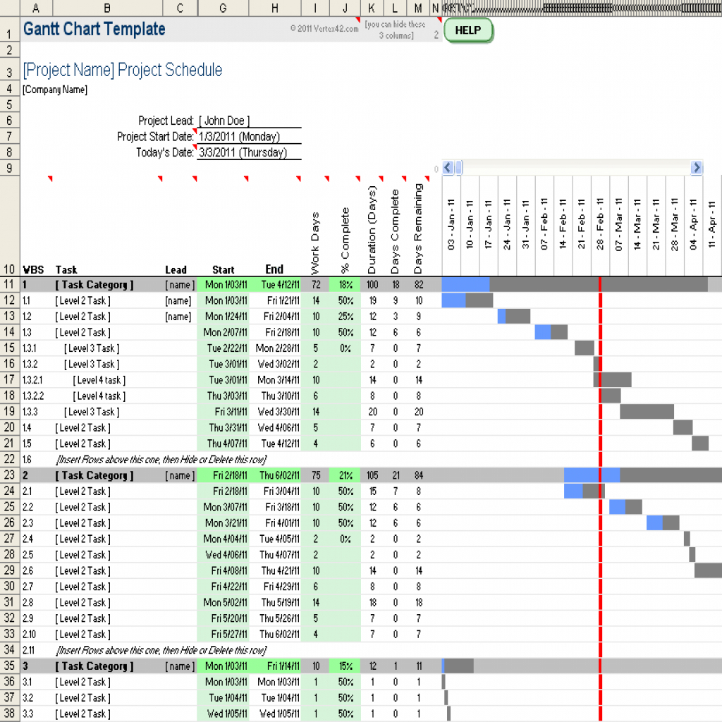
Gantt charts are invaluable tools for project management, providing a visual representation of tasks, timelines, and dependencies. Excel, while not specifically designed for Gantt charts, offers the flexibility to create effective and customizable templates. This guide details the steps involved in building a reusable Gantt chart template in Excel, enhancing your project planning and tracking capabilities.
Understanding the Fundamentals
Before diving into the creation process, it’s crucial to understand the core components of a Gantt chart. These elements will guide the structure of your Excel template:
- Tasks: The individual activities required to complete the project.
- Start Date: The date on which a task is scheduled to begin.
- Duration: The length of time required to complete a task, usually measured in days or weeks.
- End Date: The date on which a task is scheduled to be completed (calculated from the start date and duration).
- Progress: The percentage of work completed on a task.
Step-by-Step Guide to Building Your Gantt Chart Template
-
Setting up the Data Table
Begin by creating a table to hold your project data. In a new Excel sheet, enter the following column headers, starting in cell A1:
- Task Name (A1)
- Start Date (B1)
- Duration (C1)
- End Date (D1)
- Progress (%) (E1)
- Start (F1) – This column will represent the starting point of the task bar in the chart.
- Length (G1) – This column will represent the length of the task bar, based on the duration.
Below these headers, enter sample task data. Ensure the “Start Date” column is formatted as a date (e.g., mm/dd/yyyy) by selecting the column, right-clicking, choosing “Format Cells,” and selecting “Date” from the “Number” tab.
-
Calculating End Date, Start, and Length
Excel formulas are essential for dynamically updating the Gantt chart based on changes to start dates and durations. Here’s how to calculate the necessary columns:
- End Date (Column D): In cell D2, enter the formula
=B2+C2. This adds the duration to the start date to calculate the end date. Drag the fill handle (the small square at the bottom-right of the cell) down to apply the formula to all rows. - Start (Column F): In cell F2, enter the formula
=B2-MIN($B$2:$B$10). (Assuming you have 10 tasks initially. Adjust the range `$B$2:$B$10` to reflect the number of rows in your table.) This calculates the number of days between the project’s earliest start date (using the MIN function) and the task’s start date. This value will be used for the horizontal positioning of the task bar. Drag the fill handle down. - Length (Column G): In cell G2, enter the formula
=C2. The length of the bar corresponds to the duration of the task. Drag the fill handle down.
- End Date (Column D): In cell D2, enter the formula
-
Creating the Stacked Bar Chart
The Gantt chart is created using a stacked bar chart. Select the “Task Name” (Column A), “Start” (Column F), and “Length” (Column G) columns, including the headers. To select non-adjacent columns, hold down the Ctrl key (or Cmd key on Mac) while clicking the column letters.
- Go to the “Insert” tab on the Excel ribbon.
- In the “Charts” group, click the “Insert Bar or Column Chart” dropdown.
- Choose “Stacked Bar.”
A basic stacked bar chart will appear. It likely needs significant formatting to resemble a Gantt chart.
-
Formatting the Chart
The initial chart requires substantial formatting to become a functional Gantt chart.
- Invisble Start Bar:Click on one of the colored bars that represent the ‘Start’ column in the chart. These bars represent the delay. In the “Format Data Series” pane (right-click on a bar and select “Format Data Series…”), set the “Fill” to “No fill.” This makes the ‘Start’ series invisible, effectively positioning the ‘Length’ bars at the correct start dates.
- Reverse Task Order: The tasks are likely displayed in reverse order. Click on the vertical axis (the task names). In the “Format Axis” pane, under “Axis Options,” check the “Categories in reverse order” box.
- Adjust Axis Scale: The horizontal axis might need adjustment to start at the project’s earliest date. Click on the horizontal axis. In the “Format Axis” pane, under “Axis Options,” set the “Minimum” value to the numerical representation of the earliest start date. To find this number, enter the earliest start date in a cell and format it as a “Number” (Format Cells > Number > General or Number). Copy this number to the minimum bound of the horizontal axis. You can also set the “Maximum” value to a date beyond the project’s expected end date to provide a buffer.
- Customize Colors and Appearance: Customize the colors of the task bars to your preference. You can also add data labels (right-click on the bars, “Add Data Labels”) to show task names or durations directly on the chart. Consider adding a chart title and axis titles for clarity.
- Add Progress Bars: To visually represent task progress, you can add another data series to the chart. You will need to calculate another column representing the completed amount of the task. This is a more advanced customization.
-
Saving as a Template
Once you’ve customized the chart to your liking, save it as a template for future use. Go to “File” > “Save As.” In the “Save as type” dropdown, select “Excel Template (*.xltx)”. Choose a location to save the template and give it a descriptive name (e.g., “Gantt Chart Template”).
Using the Template
To use the template for a new project, double-click the .xltx file. Excel will open a new workbook based on the template, leaving the original template file untouched. You can then replace the sample data with your project’s task information. The chart will automatically update based on the new data.
Advanced Customization
Here are some ideas for advanced customization:
- Conditional Formatting: Use conditional formatting to highlight tasks that are overdue or approaching their deadlines.
- Dependencies: Add columns to represent task dependencies and use formulas to automatically adjust start dates based on these dependencies. This is significantly more complex to implement.
- Resource Allocation: Incorporate resource allocation data into the template to track resource utilization.
- Milestones: Clearly mark project milestones on the chart.
By following these steps, you can create a robust and reusable Gantt chart template in Excel, streamlining your project management workflow and providing a clear visual representation of your project timelines.
 1024×1024 excel gantt chart chart design gantt chart template pro db from db-excel.com
  1024×768 gantt chart excel template db excelcom from db-excel.com
  1280×720 simple gantt chart excel chart template microsoft office gantt from db-excel.com
 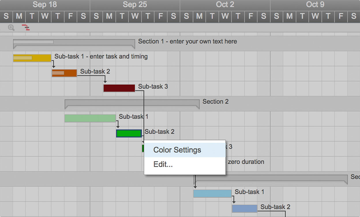 1248×753 gantt chart excel template gantt chart from db-excel.com
 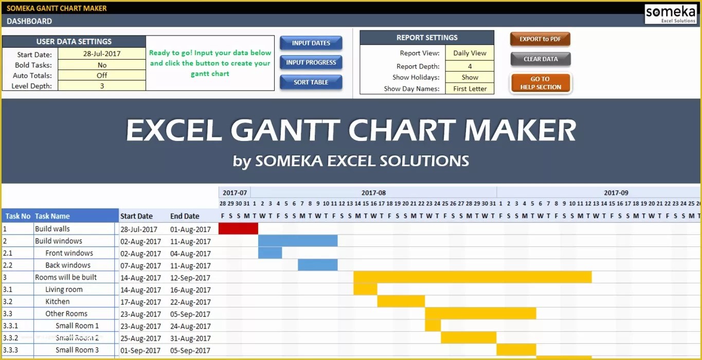 1365×700 excel gantt chart template excel gantt chart template easily from www.heritagechristiancollege.com
  1022×556 excel gantt chart prioritization blog from appfluence.com
  814×633 excel gantt chart template excel gantt template gantt from www.heritagechristiancollege.com
  0 x 0 gantt chart excel template teamgantt from www.teamgantt.com
 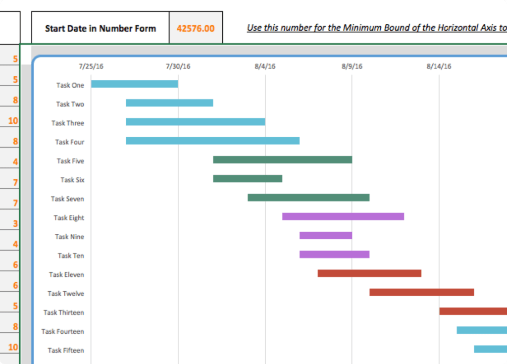 1024×735 excel spreadsheet gantt chart template db excelcom from db-excel.com
 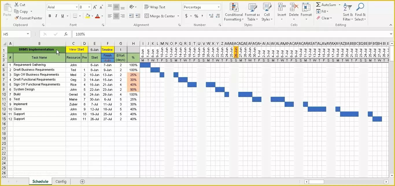 1366×644 excel gantt chart template heritagechristiancollege from www.heritagechristiancollege.com
 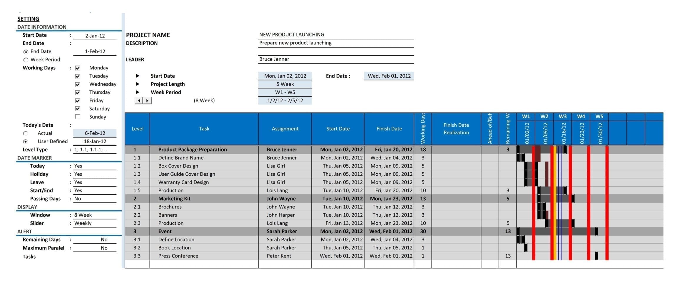 2296×970 excel spreadsheet gantt chart template spreadsheet templates from excelxo.com
 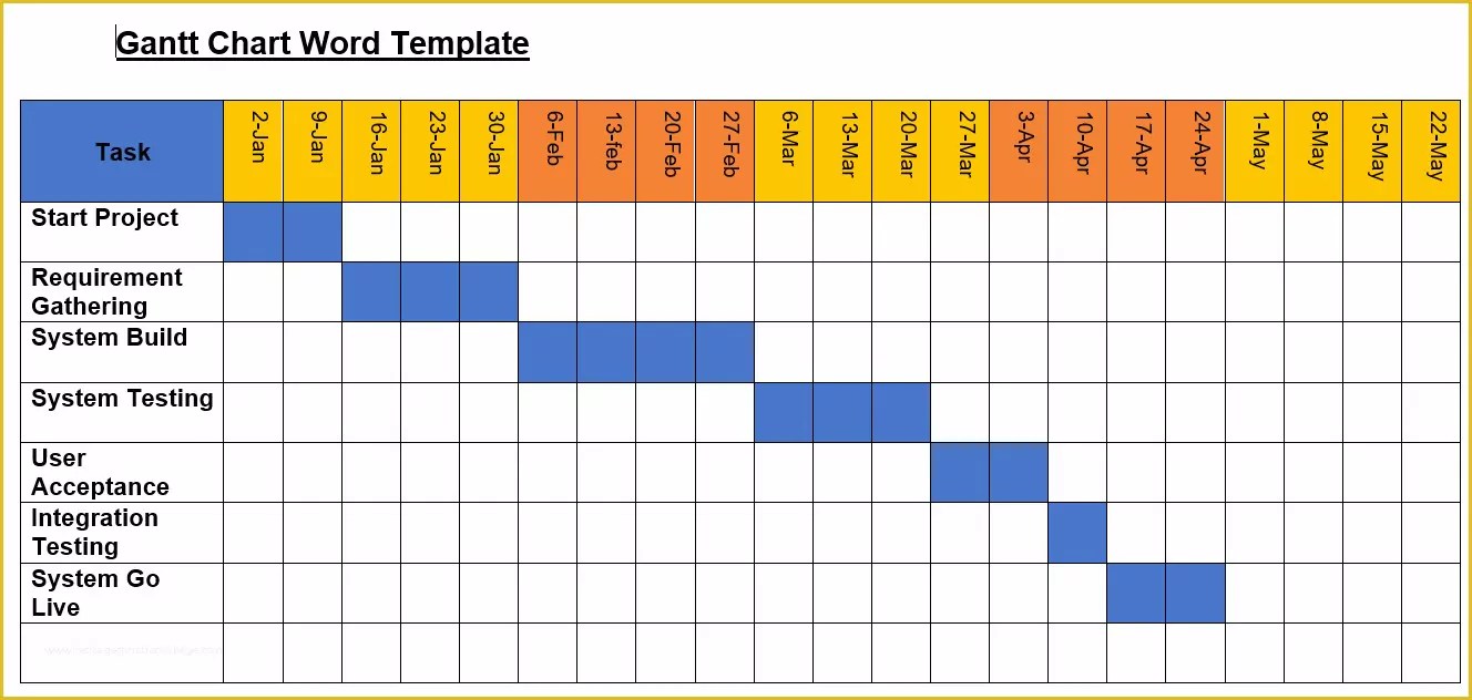 1328×632 excel gantt chart template gantt chart excel from www.heritagechristiancollege.com
  1280×729 gantt chart template excel spreadshee from db-excel.com
 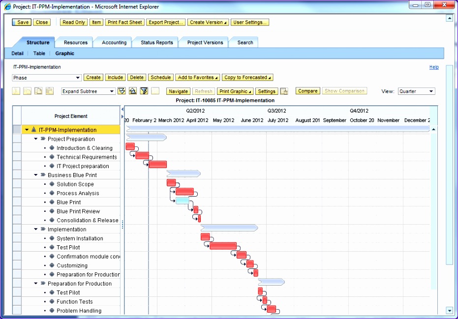 931×649 ms excel gantt chart template excel templates from www.exceltemplate123.us
 Thank you for visiting How To Create A Gantt Chart Template In Excel. There are a lot of beautiful templates out there, but it can be easy to feel like a lot of the best cost a ridiculous amount of money, require special design. And if at this time you are looking for information and ideas regarding the How To Create A Gantt Chart Template In Excel then, you are in the perfect place. Get this How To Create A Gantt Chart Template In Excel for free here. We hope this post How To Create A Gantt Chart Template In Excel inspired you and help you what you are looking for.
How To Create A Gantt Chart Template In Excel was posted in September 29, 2025 at 1:37 pm. If you wanna have it as yours, please click the Pictures and you will go to click right mouse then Save Image As and Click Save and download the How To Create A Gantt Chart Template In Excel Picture.. Don’t forget to share this picture with others via Facebook, Twitter, Pinterest or other social medias! we do hope you'll get inspired by SampleTemplates123... Thanks again! If you have any DMCA issues on this post, please contact us!